installation art
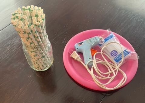
supplies
|
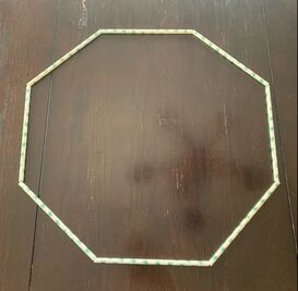
in progress photo #1
|
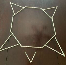
in progress photo #2
|
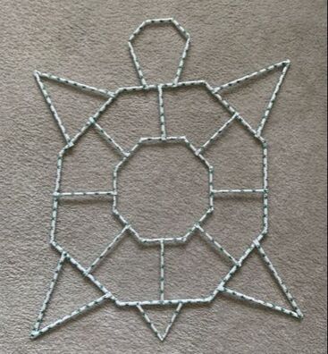
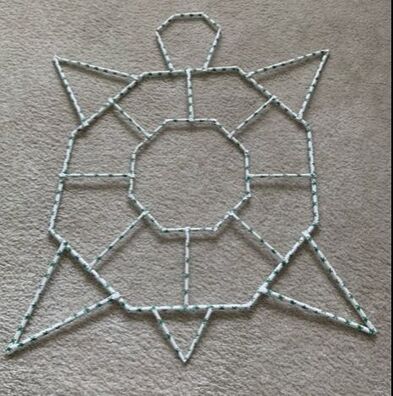
finished, final photo #1
|
finished, final photo #2
|
1. For my installation art piece I made the outline of a sea turtle using paper straws that actually had sea turtles on them. I folded and cut some of the straws in order to get the right shape I wanted and then hot glued them together. I made a sea turtle out of the paper straws because of the, somewhat, recent videos and evidence that came out about the possible dangers plastic straws can have on ocean wildlife; while getting stuck up their nose or ingested.
2. My work actually stayed almost completely on track with my original plan. I made very minimal changes to what I envisioned in my head when I came up with the idea to make this piece. I had to adjust some of the methods I used to stick the straws together, but other than that, it came out how I wanted it to from the start
3. I chose to do a piece like this because I knew I wanted there to be a message behind my piece that would either raise awareness or broadcast something important going on. I couldn't do something very intricate or crazy big and inclusive due to lack of materials, space, and time; so I think this was attainable enough for me to make while still getting my point across.
4. The meaning behind my piece is to understand how we affect the world around us; and that world contains of animals, plants, wildlife, bodies of water, habitats, terrestrial lands, and other things that provide and supply for us and we should treat this world around us with respect and care for it the way it cares for us. My main goal wasn't to highlight how "horrible" just using plastic straws can be on animals in their environment because in reality, straws make up so little percentage of the waste in the ocean. My goal was to highlight the things we can do, as a community, to help save the very thing we are destroying. Making minor changes, such as using paper or metal straws, decreasing your plastic and waste production, reducing your travel in vehicles, using biodegradable daily products, and other things, can positively affect the environment. There are so many things we can do to help the current situation that we don't even realize and that would not be much of a burden to us. Changing from plastic to paper or metal straws is a small, little step that leads to us to making bigger, major steps in the future that i'm sure the wildlife would greatly appreciate.
land art mini project
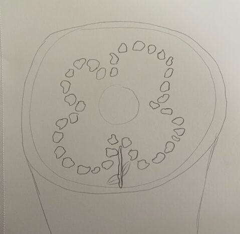
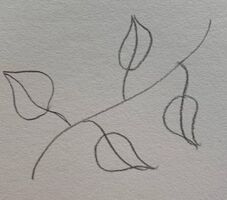
sketch, planning out
|
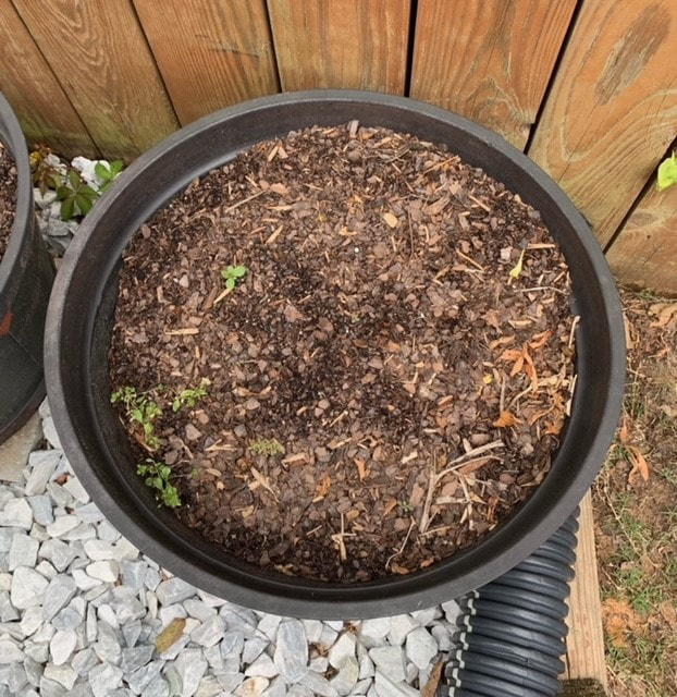
the space before the installation
|
in progress photo #1
|
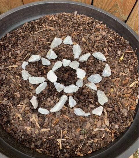
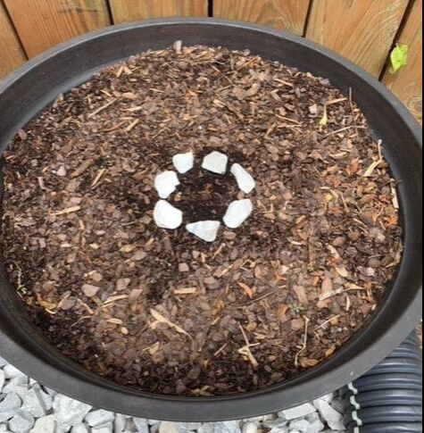
in progress photo 2
|
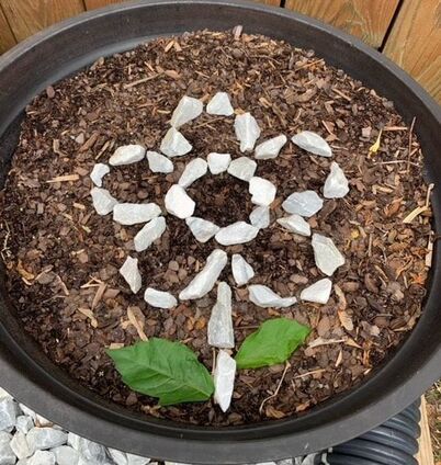
final photo of land art
|
1. I created the outline of a growing flower with stones on top of a plant pot. It is almost a foot long and about half a foot wide. I chose to make a flower because it is summertime and the weather is changing and growing, as well as the plants and organisms outside.
2. To create my flower, I used the thinner or more standard- shaped stones and rocks from my garden and placed them around into the shape of the petals. I used 2 leaves that i found near a weed to represent the leaves on the stem. I made my land art on the top of a tomato plant pot that is also in my garden and currently filled with just mulch. I wanted a plain background that wouldn't take away from the flower. 3. I think land art is great because there are endless possibilities and minimal rules to what you want to make. Every piece will be different and unique because nature comes in many various forms, colors, shapes, textures, sizes, etc. I missed school the day we talked about land art so I am not sure if i interpreted the project correctly but I believe you just use your surroundings and build an art piece using the earth as a base and its materials. I thought this project was relaxing and calming because it was outside, less pressure, and more natural. |
choice project- JEWELRY
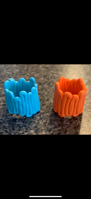
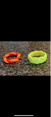
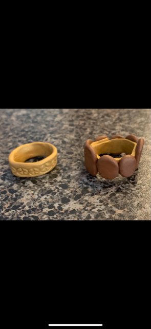
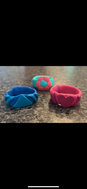
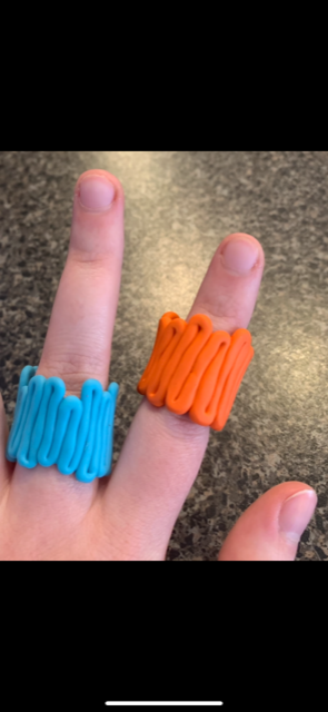
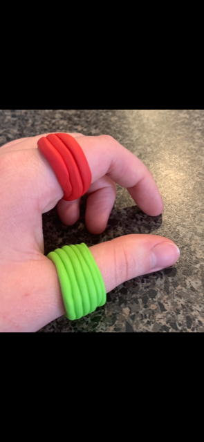
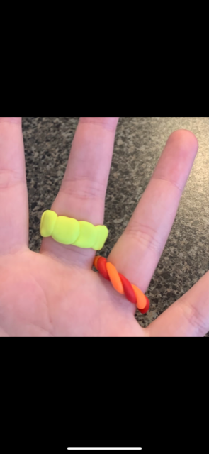
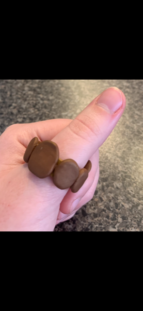
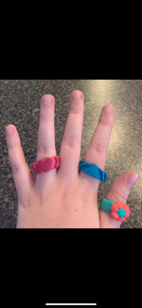
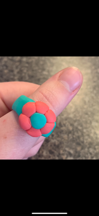
rings in progress and greenware and final photo #1 and #2
|
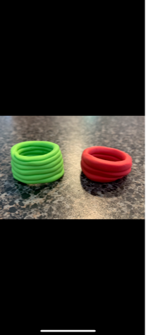
rings in progress and greenware and final photo #3 and #4
|
rings in progress and greenware and final photo #5 and #6
|
rings in progress and greenware and final photo #7and #8
|
rings in progress and greenware and final photo #9 and #10 and #11
|
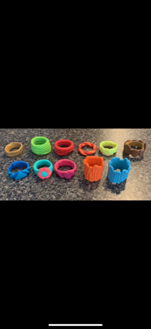
all polymer clay rings after baking in the oven (11 in total)
|
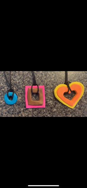
necklaces greenware and final photo #12 and #13 and #14
|
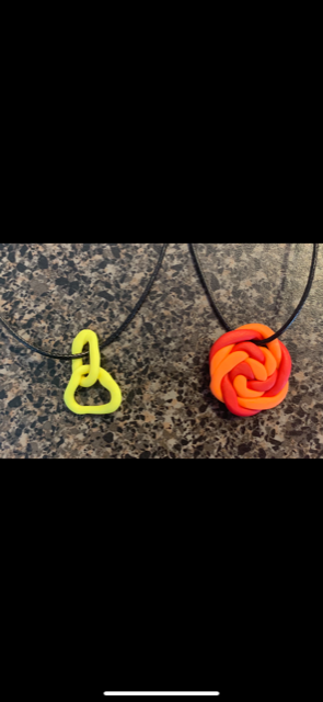
necklaces greenware and final photo #15 and #16 (16 total jewelry pieces)
|
final
|
final
|
final
|
final
|
final
|
final
|
DESCRIBE: for my choice project I chose the 15 piece ceramic jewelry option and I used polymer clay from michaels. i used different sized cylinder objects as a stand in order to form my rings and try to measure them out properly. i cut slabs of the polymer clay and created long, thin slabs to form the bands for most of the rings. Some rings were dysfunctional and different shapes or designs so I had to roll out very thin, snake like shapes and then molded them to the desired form. The theme of my jewelry pieces was repetition and similar pattern. So i used the same shape or design all around the ring or repeated the same shape numerous times. I tried to use bright colors and tacky or funky shapes for my rings. Most rings each have their own repeating pattern so I added special details to each ring and used different tools and techniques. I tried to stick to the repetition theme with my necklaces and did double shapes stacked on top of each other. I cut out different pieces and slabs and formed them into shapes and connected them to a necklace chain or rope. After i finished creating each jewelry item, I put them in foil, covered them with more foil, and put them in the oven at about 270 degrees F for about 45-55 minutes.
ANALYZE: my pieces involve balance by repeating the same shape, detail, or design numerous times and keeping symmetry in a lot of the pieces. I used line to draw on peace signs to a ring and to form some of the dysfunctional shaped rings.
INTERPRET: My original plan was to stick to almost a "mod" theme and use strictly bright or light colors only. But then as I started coming up with more ideas, I noticed I was distancing away from the mod theme and going into more of a tacky theme and wanted simple yet bubbly, thick, and repetitive looking pieces. so I altered my theme a little into more of a tacky, repetitive, and childish nature. I still used many bright colors but also included tans and browns for some of them. i just wanted funky rings and necklaces and didn't want to stick to a super specific theme.
JUDGE: I feel as though my 16 piece jewelry set was overall successful. This was my first time working with polymer clay and my first time making jewelry in general so it took me a little to get the hang of it and some of the rings don't fit perfectly but I still feel like most of the rings and necklaces are different and pretty unique and that I would wear them in public. My goal was to make jewelry I would enjoy wearing and to just like the way they came out, and I do, so I would consider this a successful project and will probably make more pieces in the future with the rest of my polymer clay.
NCMA INSPIRED
DAY 1:
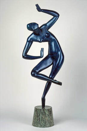
Title- blue dancer
Artist- Alexander Archipenko
Date Made- modeled 1913–1918, cast after 1961
Size- 41 x 18 inches
Medium- bronze with blue patina, marble base
What Do I See- an abstract model of a dancer
Why This Piece?- I like the exterior and how its shiny and I also like how it looks soft and bendy; yet hard and sharp at the same time
DAY 2:
Colors- the color is a bronzed dark/deep blue. Even though it is just one shade, the color scheme would have to be monochromatic
Textures- It is silky and smooth looking
Subject- This piece is an abstract model of a professional dancer. It looks as though she is mid performance and is swaying and moving around in different ways
Meaning- I think the artist was just trying to "capture the moment" and show the versatility and the unique aspects to dancing
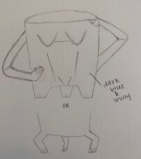
sketch of the mug
|
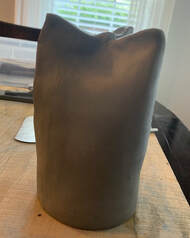
in progress photo of the mug
|
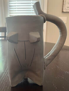
finished greenware photo of mug #1
|
finished greenware photo of mug #2
|
finished greenware photo of mug #3
|
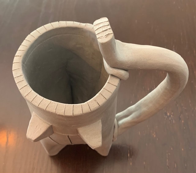
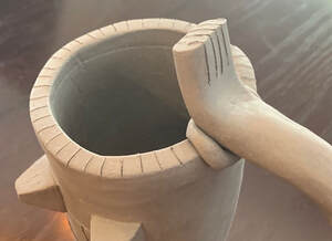
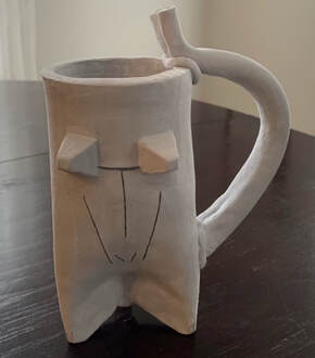
DESCRIBE: I made a tall, slimmer, mug out of clay. the mug is simple and bare around the back but the front has a simple imitation of the blue dancers body. I included 2, 3D, cone shaped clay pieces on the upper part of the mug and a straight line carved between them. Then a straight line going down vertically forming a capital "T" with those 2 lines to appear like abs. Then carved 2 lines that were angled towards each other and not parallel to form the torsos shape and carved a lowercase "v" at the lower part of the mug in between those 2 non parallel lines. The handle is thick and bigger and the top of the handle goes up passed the top rim of the mug. That high end has 4 lines carved into the top part to look like the dancers hand that she has stuck up. The top rim of the mug has lines across it.
ANALYZE: I started making this mug by forming a big slab of clay and smoothing it out into a rectangle shape. Then, I rolled that clay slab to form a cylinder shape, the base of my mug. Next, I connected the ends and started smoothing it out. After that, I flipped the cylinder upside down and started to form the tripod part at the bottom of the mug. After I had 3 tripod legs for my mug, I let the mug dry in a plastic grocery bag overnight. the next day I started to work on the handle and created a large stick of clay. I stuck that clay to the mug leaving excess clay at the top. I then carved into the top of the handle, creating the hand like appearance. Next, I formed the clay cones and stuck them onto the mug, as well as carving the straight lines where I needed them. I finished by carving lines at the top of the rim of the mug.
INTERPRET: My piece is inspired by the NCMA piece by trying to recreate the body image of the blue dancer. The handle represents her arm and her hand. The cones represent her breasts. The lines represent the contours of her body and her torso. I am planning on glazing it a dark or metallic blue to imitate the color as well.
JUDGE: So far, I think my piece is kind of successful. I made a tripod mug and used the NCMA artwork to inspire my piece which was the assignment. Again, this piece is simple and doesn't have much to it, but the artwork I chose was also simple and minimalistic so it fit the idea. I struggled with making the handle look right and connecting the slab into one cylinder instead of the rectangle, but other than that, most of the parts worked out at least enough to get the point across as to what I was trying to do.
mug after firing (made it gray instead of navy)
sgraffito
sketch 1
|
sketch 2
|
progress photo 1
|
progress photo 2
|
progress photo 3
|
progress photo 4
|
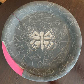
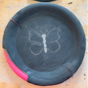
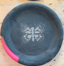
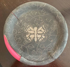
final greenware sgraffito piece 1
|
final greenware sgraffito piece 2
|
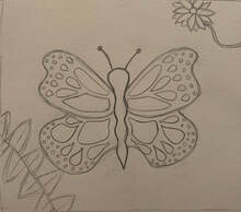
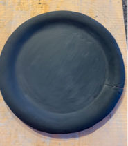
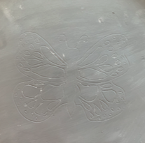
DESCRIBE: I made a plate out of clay using the technique, sgraffito. I first started by flattening out a large slab of clay and making sure that clay is smooth. I then put that large slab of clay carefully onto a plastic plate. After the clay was on the plate, I cut off and carved the sides in order to fit the proper shape. Then I smoothed that clay out again and waited for it to dry a little more. I started to layer on the black underglaze on my plate and waited for that to dry as well. Next I traced my butterfly sketch onto my plate and began to carve out the different parts of my butterfly from the plate. I continued to do that until the butterfly was done and then I just freehand drew and carved the leaves into the background, trying to be cautious around the cracks.
ANALYZE: I used design in my piece through lines and patterns and symmetry. I tried to keep the pattern in the butterfly wings as symmetrical and equal as possible so they would match. I also used different lines to make the leaves. I tried to space out the leaves so there weren't clusters or sparse areas in different spots.
INTERPRET: I tried to balance out the black and white by including the leaves. I originally just wanted to do a simply butterfly in the middle but noticed a lot more black in the black-white ratio, which is why I put the leaves in. I wanted the black areas to still be prominent but not take away from the butterfly too much. I kind of like how the majority of the white is in the middle and the majority of the black is on the outer edge. I chose a butterfly because I knew I wanted to do a bug or insect and a butterfly seemed doable and also pretty for this piece.
JUDGE: I would say my piece could have been successful but unfortunately, due to the major cracks and splits, it was not. I had to redo this plate numerous times because my clay kept cracking or breaking and I had a very hard time preventing that. I didn't want to waste clay and was falling behind so I just kept going on this piece even though the cracks started again. However, because of the cracks I do not think I will be able to use this plate or fire it without it shattering completely. Although, I do like my design, specifically my butterfly, I didn't put as much effort into it knowing that the plate was going to break in the end. I don't think I will try sgraffito again unless I was in a classroom and had the proper tools and was able to find a way to prevent splits.
FINISHED PHOTO IS NOT AVAILABLE BECAUSE IT CRACKED AND BROKE INTO DOZENS OF PIECES BEFORE I COULD GET IT FIRED
animal head
sketch/reference photo 1
|
sketch/reference photo 2
|
sketch/reference photo 3
|
in progress photo 1
|
in progress photo 2
|
in progress photo 3
|
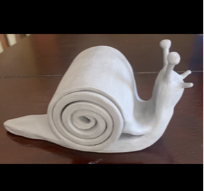
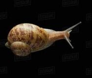
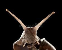
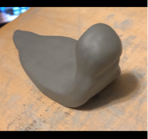
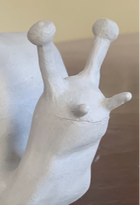
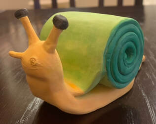
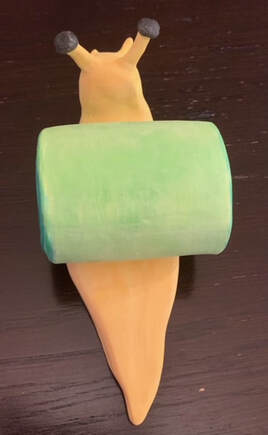
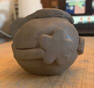
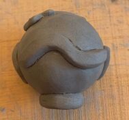
finished animal head 1
|
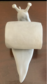
finished animal head 2
|
finished animal head 3
|
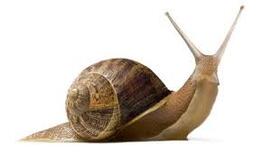
DESCRIBE: I made a snail head and body. I started by creating the body of the snail and molding the body into the desired shape while forming the base of its head. After I finished the body i started working on the shell. I took a long slab of clay and rolled it up into a tight ball and then placed the "shell" on the body. After the shell, I started working on the snails face. I added its eyes and facial features, making sure to be very careful with the small, thin pieces of clay. Then I smoothed out the snails body and the face in order to make it look clean and neater.
ANALYZE: I didn't include much texture on the snail because typical snails are smooth and slimy. I tried to give the snails body/tail a "sleek" appearance.
INTERPRET: I picked a snail because they are one of my favorite animals. At first I was going to do a triceratops but I attempted to make the head multiple times but it was not working out and I was falling behind. A snail was my second choice on my list of ideas so I automatically tried that next and it only took me one attempt. I also think I can use the snail as a decoration.
JUDGE: I think my piece could be better but I still like it. It is simple and not super detailed but I kinda like that part of it. I think if I attempted to add crazy textures and details that I would have ruined it or messed it up. I had a hard time figuring out how to make the shell the way I envisioned it to be but I think it turned out fine. I think its overall successful since you can tell what animal it is and because I personally like it. I did like this project and I would definitely do something similar on my own in the future.
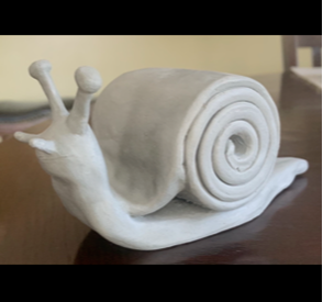
finished snail head, watercolor
|
finished snail head, watercolor
|
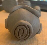
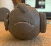
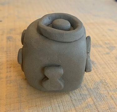
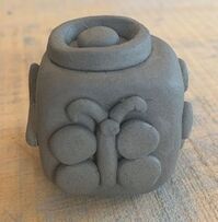
clay stamps
added relief #1
|
added relief #2
|
added relief #3
|
added relief #4
|
added relief #5
|

added relief #6
|
added relief #7
|
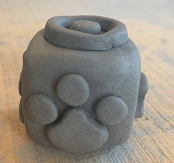
added relief #8
|
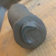
carved relief #1
|
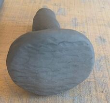
random object #1
|
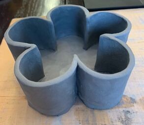
Designed pinch pots
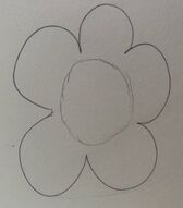
sketch photo
|
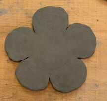
in progress photo
|
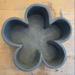
final clay piece photo
|
final clay piece photo
|
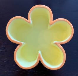
DESCRIBE: my designed pinch pot is roughly 3 inches high and roughly 5 inches wide. it is in the shape of a cartoonish flower. the walls of the 'petals' are thinner and there are 5 'petals' total. the petals are wrapped around a circle, or the center of the 'flower'. the 'petals' are shaped like a circle that's about 3/4s the way drawn. the sides are bare as well as the bottom. It is very simple and easy but you can tell it is shaped like a flower
ANALYZE: At first I was going to form a sphere of clay and press it into the shape of the flower but I tried multiple times and it did not turn out correctly, so instead I decided to individually make the petals and the base. i started by taking a larger, flat piece of clay and shaping it into my desired flower shape. Then I took little spheres of clay and formed them into the 'petals' with my thumb and clay tools. Then i connected my 'petals' and base by pushing them together after slashing and wetting the areas of clay I would be connecting. Then I cleaned up my piece and fixed the rough edges with my hands and clay tools.
INTERPRET: I showed my theme of shape by making the desired form obviously conveyed from multiple different angles. You can tell it is in the shape of a flower by standing next to it, directly over top of it, and under it.
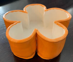
JUDGE: I think my designed pinch pot is pretty successful. Although it is more simple, I kind of like that the most about it. It's not busy or crowded but it's still fun and can be useful after its fired. I can use the glaze to make it have fun colors if I want to make it a little more diverse or unique but even if i kept it easy with the glaze i still personally think i would like it. It took a little long to actually form it and make it look clean and neat but i enjoyed it.
ANALYZE: At first I was going to form a sphere of clay and press it into the shape of the flower but I tried multiple times and it did not turn out correctly, so instead I decided to individually make the petals and the base. i started by taking a larger, flat piece of clay and shaping it into my desired flower shape. Then I took little spheres of clay and formed them into the 'petals' with my thumb and clay tools. Then i connected my 'petals' and base by pushing them together after slashing and wetting the areas of clay I would be connecting. Then I cleaned up my piece and fixed the rough edges with my hands and clay tools.
INTERPRET: I showed my theme of shape by making the desired form obviously conveyed from multiple different angles. You can tell it is in the shape of a flower by standing next to it, directly over top of it, and under it.
JUDGE: I think my designed pinch pot is pretty successful. Although it is more simple, I kind of like that the most about it. It's not busy or crowded but it's still fun and can be useful after its fired. I can use the glaze to make it have fun colors if I want to make it a little more diverse or unique but even if i kept it easy with the glaze i still personally think i would like it. It took a little long to actually form it and make it look clean and neat but i enjoyed it.
when I first picked up my pinch pot after glaze firing
|
after glaze firing and painting, final pinch pot 1
|
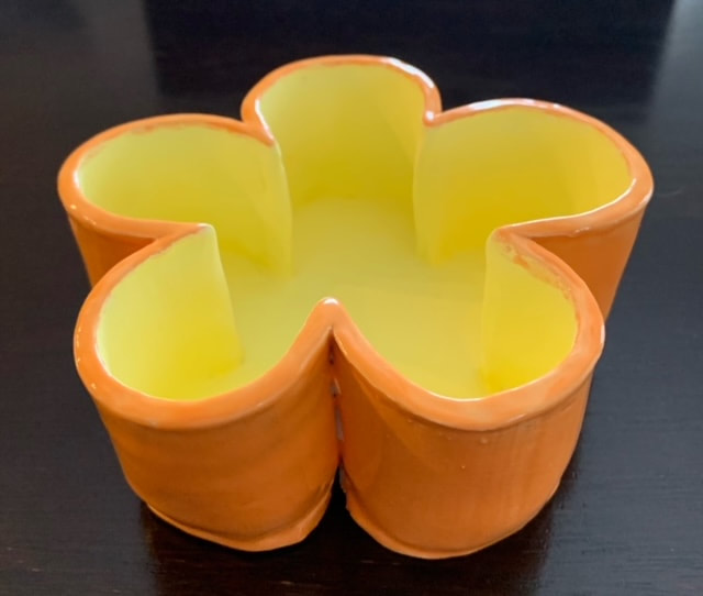
after glaze firing and painting, final pinch pot 2
|
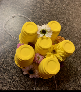
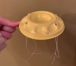
wearable art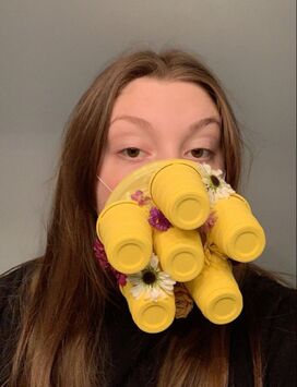
finished project
|
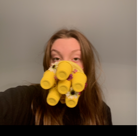
finished project, the weebly site made the photos blurry after cropping
|
finished project
|
wearable art pt 2
in progress photo as well as experiment photo
|
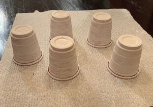
in progress photo as well as experiment photo, was unsure of what to do next
|
DESCRIBE: for my wearable art piece, I wanted to make an abstract version of a beehive. The base of the mask that covers my mouth and nose is the bottom plastic part to the cherry tomato containers you buy from the store. I took 2 pieces of thin, elastic string and tied them through the holes and again at the end to wrap around my ears. I then painted about 6 of the plastic mini solo 'shot glass' cups white and then finally painted them a bright yellow all over. I hot glued the yellow mini solo cups onto the yellow cherry tomato bottom container around in a circle and one cup in the center. This way it could mimic the hexagon shaped beehives. In between and around the mini yellow solo cups i hot glued smaller flowers of all different colors and types. Then you just put the yellow bottom directly over your mouth and nose and wrap the elastic string behind your ears and that's it.
ANALYZE: I think my wearable art piece is pretty cohesive. The yellow is consistent as well as the placement of the mini solo cups. The flowers also match the work because my piece was influenced by beehives and bees are often associated with flowers and summer. I also feel like the location of the flowers and the mini solo cups are well balanced and its pretty evenly spread out.
INTERPRET: The overall mood or feeling of my piece is more happy, optimistic, warm, and joyful because of the use of the color yellow, which is often seen as a happy, summer, sun color. Flowers are also something that radiate positive energy and feelings.
JUDGE: I feel like my wearable art piece was more successful than not. The process of making it went pretty smoothly and I think it came out pretty good. It ended up looking like how I expected it too so that is a good sign. I had fun making it and personally liked how it turned out and that is what art really is about.
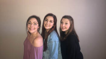 i am on the far right
Abby Roll
she/her
I was born in detroit and I definitely prefer the cold and being up north more.
I am good at coloring in coloring books.
I just want to learn about clay in general this semester.
she/her
I was born in detroit and I definitely prefer the cold and being up north more.
I am good at coloring in coloring books.
I just want to learn about clay in general this semester.
