animal portrait oil painting
brainstorming ideas

Idea #1- my sisters dog, Apollo
|

Idea #2- my dog, Buddy (I chose Buddy)
|
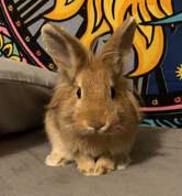
Idea #3- my bunny, Ginger
|

Idea #4- the dog I dogsit, Hank
|
reference photos/sketch

Reference photo #1- him laying down with his head up looking at me, side view
|
Reference photo #2- him laying down with his face down, eyes looking at me
|

Reference photo #3- him sitting down looking at me with his head tilted
|

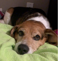
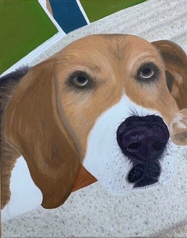
Reference photo #4- him laying down on the stairs, mainly a headshot, him looking up to the side (I chose this picture)
|
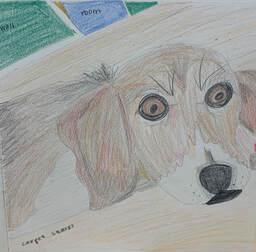
final color sketch of the picture on the left
|
practices
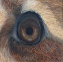
practice painting of a dog eye
|
practice painting of fur
|
in progress
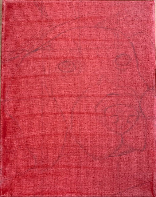
In progress #1- traced details down in pencil, created a grid
|
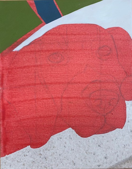
In progress #2- painted the wall colors in the background, put down a base color for the stairs, started adding in the carpet detailing and texture and shadows
|
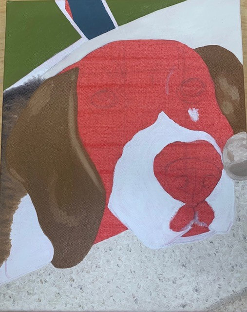
In progress #3- added white details in the back, painted base colors for his ears and paw with highlights, painted his body on the side, added white to his face
|
In progress #4- added more carpet texture, added more base colors and fur textures to his face and ears, started nose, mouth, and eye details
|
final painting
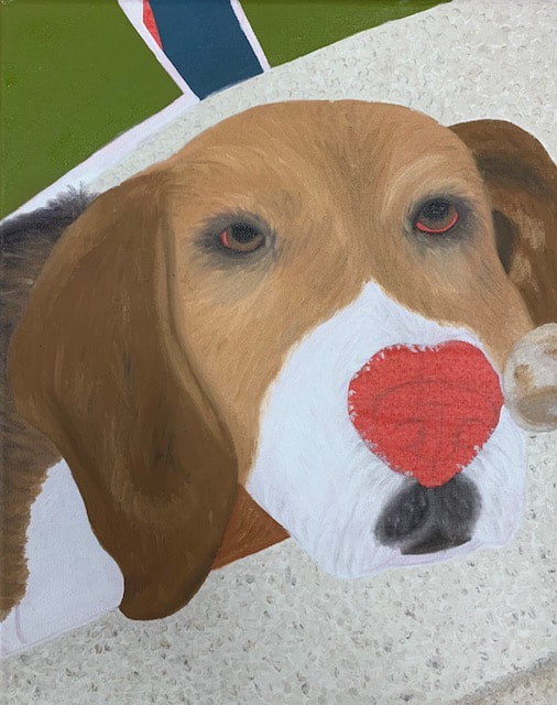
final picture of my animal portrait oil painting of my dog
Self Evaluation Questions:
1. I think the craftsmanship of my painting is decent. Overall, I would say it is neat and you can clearly tell what i was painting. I think some areas of my piece could have been better like maybe making the bottom right part of my dogs face stand out more from the carpet or focus more on the walls in the background, however I think I still executed my painting alright
2. My work uses the elements of art in different ways. I included textures in the carpet, the fur, and the nose area. they're is a good use of line, shape, and space that helped me draw the outline of my dogs face. I incorporated many different shades of each color I used to add value and texture and realism. All the elements of art work together to make a more successful piece
3. I chose to do my dog, Buddy, who is a 12 year old beagle. We rescued him when he was 10 months old and he is a very important part of our family. I chose to paint him in this way because the majority of the time he is very calm, loving, cuddly, sleepy, and sweet. I think that picture showed those characteristics all in different ways and I wanted to capture him doing his favorite thing- just laying around
4. The emphasis of my artwork was Buddy's face. In order to enhance that, i made it take up most of the canvas and used different colors and values to grab the attention of the viewer
5. I used texture in numerous areas throughout my piece. I started by adding texture using a new technique to the carpet in order to make it look more like it would in real life. I also added texture to Buddys fur on his back and is head. I did that by using a smaller brush and flicking it outward. Then I added more texture to his nose by using different colors, brushes, and putting in highlights and contours. All of those textures made the artwork look more realistic and captivating
6. Learning how to paint an animal eye and how to paint fur helped me prepare and plan for this project. I knew I needed to take certain steps to help me make a more successful piece. Watching video tutorials, practicing by myself and with the class, creating a grid, printing out my picture, and working through my piece in steps was all really helpful. I would say my artwork was successful in my eyes. I have always had a hard time with drawing or painting animals and I think this was a big step for me. I personally think my artwork could have been better but also was pretty good for a beginner
7. I have a love-hate relationship with oil paint. it taking so long to dry was a negative thing that caused setbacks 90% of the time, however on some occasions that came in handy. I think it paints on pretty smooth but sometimes almost too smooth that it just thins out and gets messy pretty easily. I like acrylic better than oil paint, but I think I might like oil paint better than watercolor
8. One thing I struggled with was running out of time. I basically painted this whole thing in one week and I while i'm glad i was able to finish, i wish i could have focused more on certain areas of my work. I also had some difficulties with the eyes and making them look realistic or the right size. If i could go back and fix something, the big thing i would change would be to enhance the difference between the bottom right part of his face and the carpet. I think they blend together a little too much
landscape oil painting
brainstorming ideas
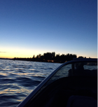
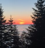
Idea #1- lake during sunset in washington
|
Idea #2- lake michigan during sunset with trees
|
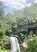
Idea #3- waterfall in the NC mountains
|
Idea #4- unknown landscape i saw during a drive to michigan
|
Idea #5- flowers and greenery in SC
|
Idea #6- sunset on a lake on the border of NC and virginia
|
reference photos/sketch

I chose idea #3, the waterfall in the NC mountains. since it is my own photo this is my reference photo and compositional sketch
|
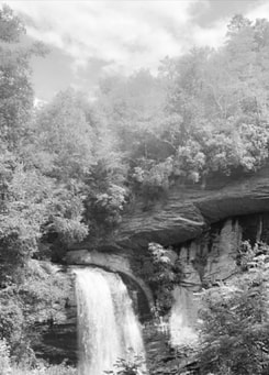
same photo in B&W to see contrasts
|
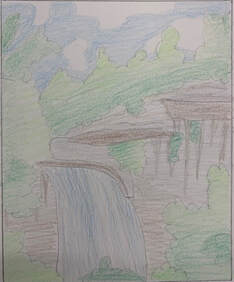
final color sketch
|
in progress
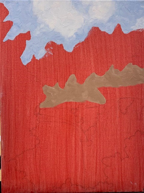
In progress photo #1- traced some parts in pencil, added the sky and clouds with a palette knife and blended with a brush, added down a base color for the rock
|
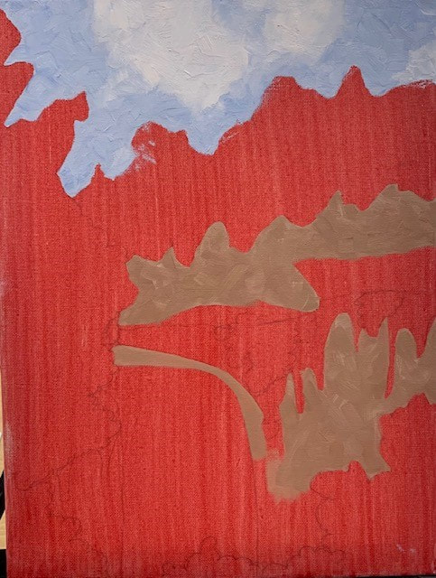
In progress photo #2- added some more base color for the rock, adding textures
|
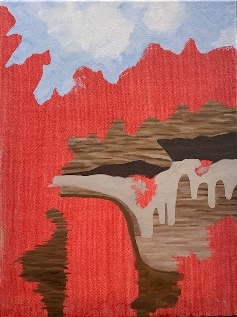
In progress photo #3- added more paint to the clouds, put down more base colors for different parts of the rock, added shadows, added texture to the rocks
|
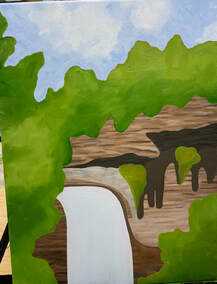
In progress photo #4- added most of the greenery base colors, added the base paint for the waterfall, put in some more colors and textures for the rocks
|
final painting
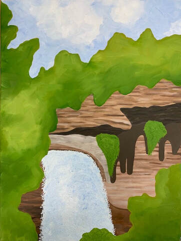
final photo of my landscape oil painting
self evaluation questions:
1. I would say the craftsmanship of my painting is alright. I think it is decently neat but looks a little messy in some areas, and while that was intentional for some parts of my piece it was not meant to look like that for other parts. I think my execution was okay, I wanted to make this look unique and simple but with many different textures and I don't know if i really expressed that
2. I chose the colors mainly based off of my reference photo. I wanted more neutral colors and didn't want any colors you wouldn't see appear in nature naturally. I tried to use numerous shades of the same 3 colors- green, blue, and brown, in order to keep my piece harmonious
3. I created contrast in my painting by adding shadowed areas underneath parts of the rock, adding lighter and darker areas in the trees, and by adding many shades of browns to my rocks to give the effect of the natural contours and layers you see on mountain sides. There are very light sections, medium sections, and dark sections in my painting so it does not conform into one big blob
4. My concern for my artwork was creating different textures and brush stroking techniques to make each area stand out from each other. I used many types of brushes and tools to give the effect of having multiple textures and appearances to each part. The technique I used for the waterfall made it look more like a waterfall, and the technique I used for the rock made it look more like the edge of a rock mountain cliff, etc. I used highlights and shadows in my painting to create value and contrast and to mimic a sense of reality, considering I didn't paint it to be realistic I wanted some aspects to be true
5. I tried to create depth by adding shadows and darker areas towards the back to make it appear as though the sun is towards the front and that is why the things you're looking directly at are lighter. I added different layers of trees and greenery in different sections, some greenery layered on top and other greenery layered behind, that way it doesn't look like its all completely 2D
6. I used many painting techniques such as using a palette knife, using a palette knife and then smoothing with a brush, using heavy amounts of paint on my brush and just swiping the brush on its flat end or pointed end carelessly, using a fan brush and globbing the paint on the canvas, and by using repeated patterns in different areas of my work
7. I had some major difficulties with things like time, technique, and detailing. I had a hard time creating the textures on my artwork without the paint just blending together like it would normally because it was oil paint and didn't dry fast enough. I wanted each part to stand out in its own way, but I think the trees look neglected because the paint would not layer on top properly. I also wanted to add little and more specific details but I felt as though that would have taken quite a while considering there was a lot of ground to cover and not enough time for the paint to dry and me to be able to layer. I also originally went in wanting to do my entire painting using the palette knife technique however it was hard for me to put the paint down in the proper spot and maneuver the palette knife properly without getting messy and having the red underneath constantly show through
8. I did have some success with this painting. I like the way the waterfall looks and i like the pattern on the rocks. I also like my color choices. Although this is very simple and doesn't look as intricate as some of the other paintings, I think it is still unique
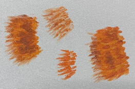
oil painting practice
brush
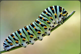
oil painting practice, caterpillar reference photo
|
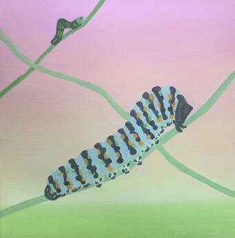
oil painting practice, caterpillar and inch worm
|
palette knife
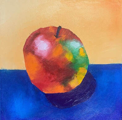
painting of apple with palette knife
Oil paint-100 color challenge
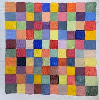
100 color oil paint challenge
hundertwasser/klimt inspired abstract painting
brainstorming ideas
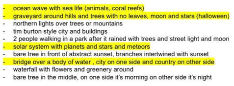
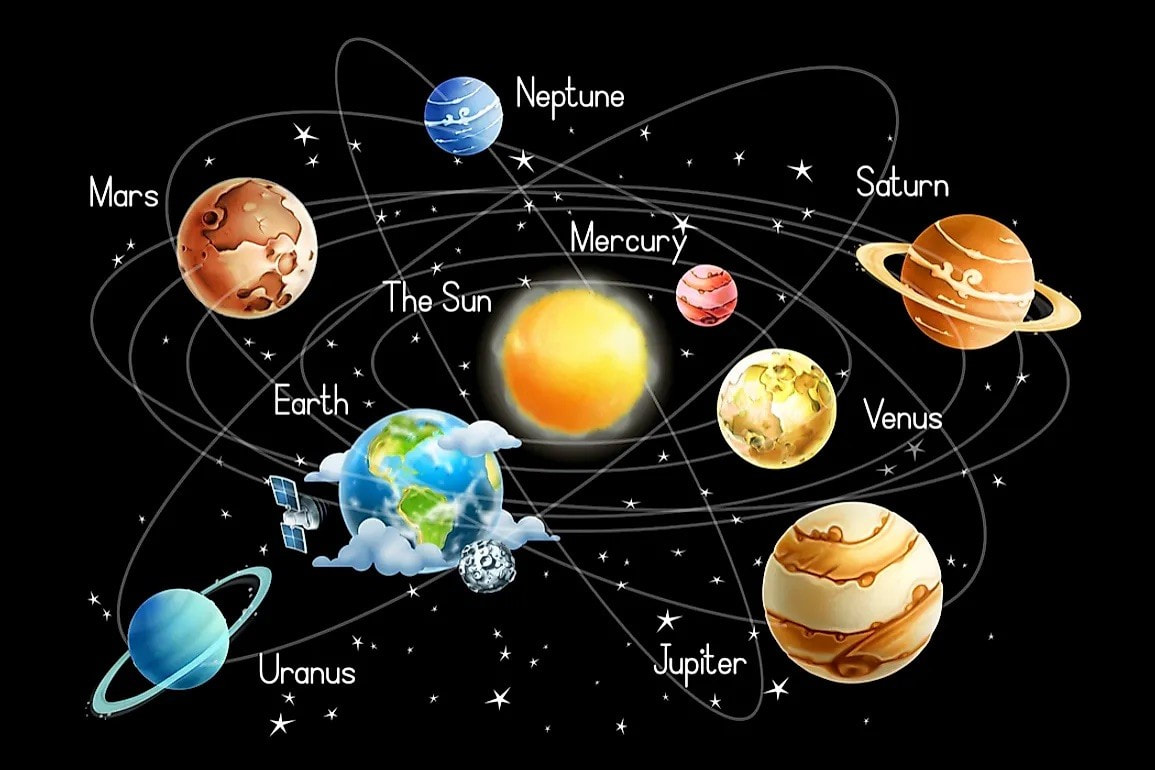
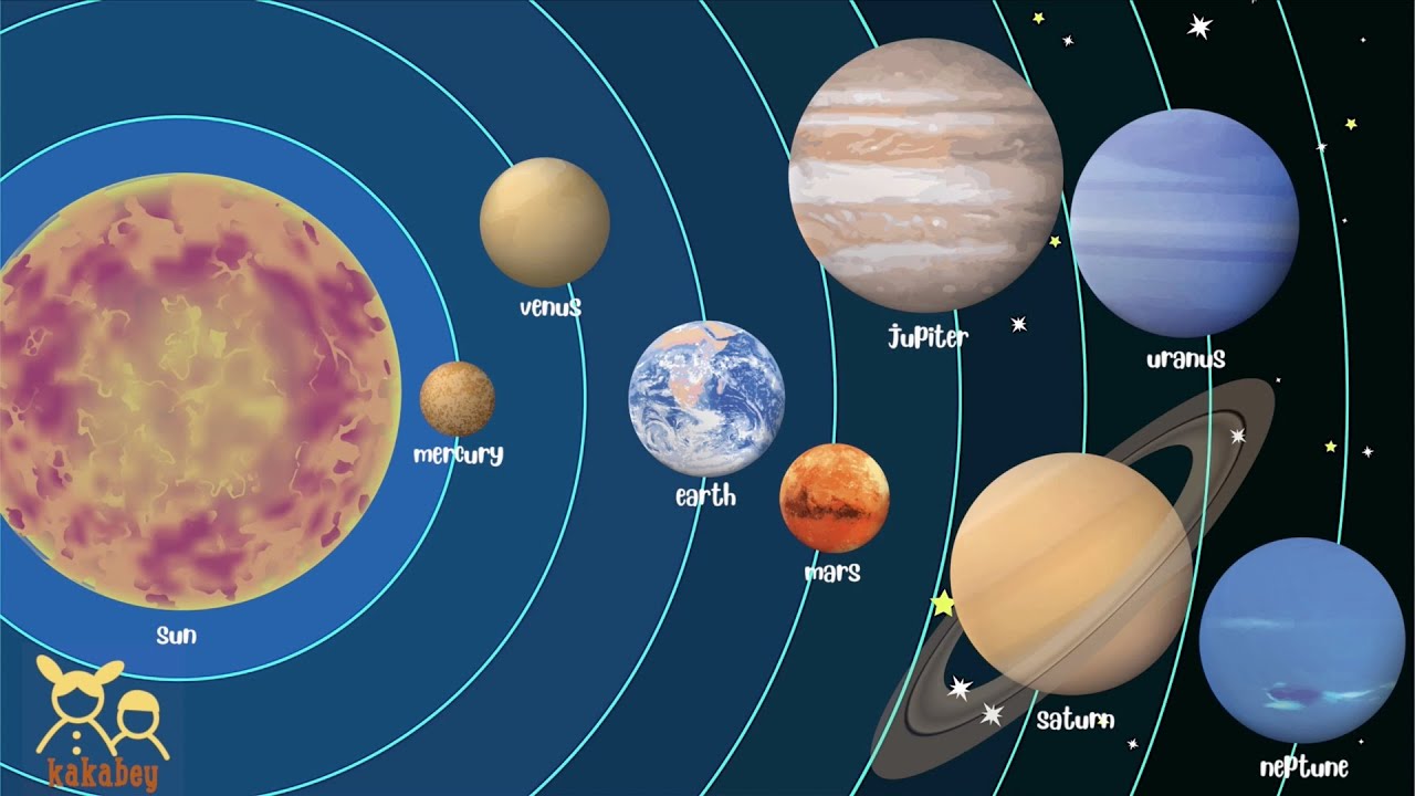
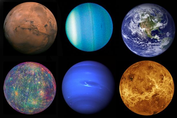
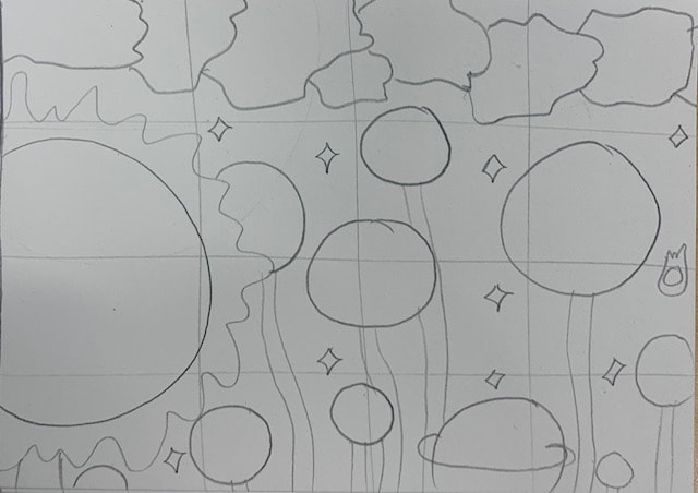
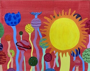
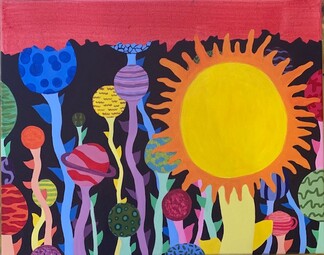
brainstorming ideas for the project, my favorites were the graveyard with a main tree and the solar system as flowers
composition photos/references
reference photo #1
|
reference photo #2
|
reference photo #3
|
composition photo #1
|
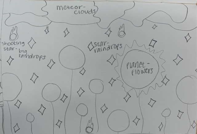
composition photo #2
|
composition photo #3
|
composition photo #4
|
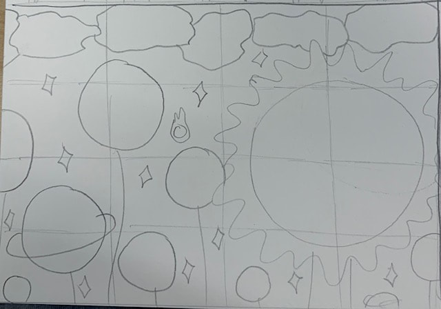
in progress
In progress photo #1- started painting the areas that would be painted a light color white to prep, started getting the base color down for certain planets
|
In progress photo #2- started painting more planets, getting base colors down as well as working on adding some patterns, and layering colors
|
In progress photo #3- almost done with painting the actual planets, adding more layers and patterns
|
In progress photo #4- finished the planets, started painting the stems of the planets
|
in progress photo #5- finished the planets and stems, painting the leaves, started adding first layer of the background color
|
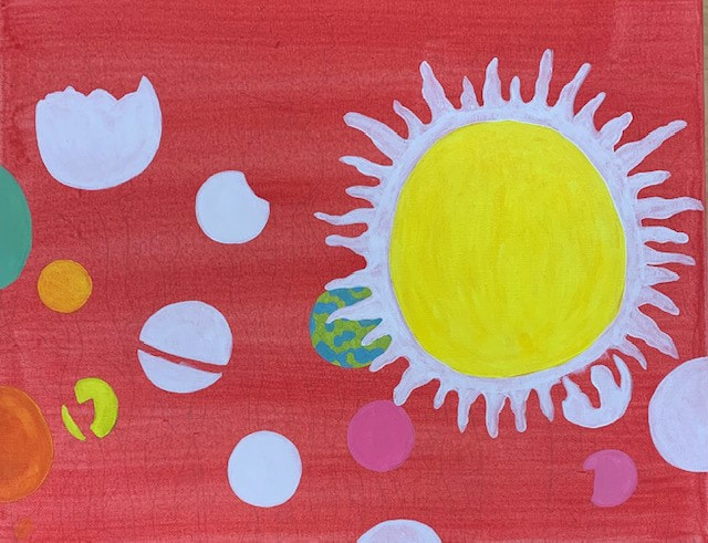
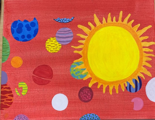
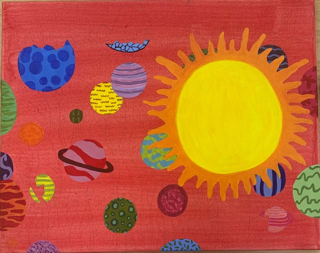
final
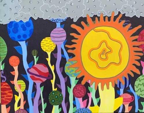
final photo of my abstract piece
self evaluation questions:
1. I would say the craftsmanship of my painting is good. I think my piece is pretty neat and clean. I could have considered having different parts of my painting connect better or flow better together, maybe try to create more depth, but other than that I think you can tell I took my time and was patient with it.
2. I would say I captured the style of Hundertwasser and Klimt by using repetition, random patterns, a spiral, and different colors.
3. My color choices were a little random but also planned out. I used all the colors of the rainbow when making my planets, however, each planet was filled with similar colors, colors that sit next to each other on the color wheel, or different shades of the same color. The stems and leaves all matched the planet they were attached to as well. The stems were shades lighter than the colors used in the planets and the leaves were shades darker than the colors used in the planets. Most the planets weren't realistic or typical colors but I did keep the sun shades of yellow and orange, the meteors gray, and the background a dark purple
4. The focal point of my work is the sun and the swirl in the middle of it.
5. I used patterns to embellish my artwork by incorporating numerous designs that were all different and unique in each planet. No two planets were similar, but I repeated the same pattern inside each individual planet throughout the circle. I wouldn't say there is much texture in my piece. I wanted to try and capture some texture in the meteor-clouds by creating 'craters', but I don't think I excelled in that area. I did want my work to look 2D and not have much depth, but I think adding texture there could be interesting.
6. I did not use a border design but I did use a spiral. My spiral was inside of the sun. Because most of the other planets are pretty busy and have a lot going on in them, I wanted to keep my main focal point pretty simple and subtle so you could really see the spiral. To do that, I painted the base of the sun yellow, the rays painted orange, and the spiral is painted orange-yellow. To emphasize the spiral more, I outlined the spiral in gold sharpie to match the rest of the outline for the sun. I think the spiral adds something to my piece and makes it more visually appealing.
7. Some obstacles I faced when making this painting was having to constantly layer and layer and layer on the paint. the red background color seemed to seep through every color, some colors worse than others, which caused me to have to add 2-6 layers of paint in the same spot. That was very time consuming and a little stressful when trying to finish this project in a specific amount of time. I also had a hard time making the meteor-clouds look how I pictured them in my head.
8. Some parts that I had success with was keeping the planets pretty circular and keeping the patterns and designs neat. I think I got creative when coming up with the different patterns and did a good job matching colors. I think my painting looks clean and smooth, which I needed a lot of patience for, but I think it was worth it. Planning and sketching was decently important for my piece. I used the same placement of the sun, some planets, and the meteor-clouds in my sketchbook that I did my painting. However, I did freestyle some aspects like other planets, the spiral, and most the patterns inside the planets, and didn't incorporate some parts like the star-raindrops that I did have in my sketchbook. I think having a rough draft is pretty essential when trying to create a successful piece, but it is fine to change your mind or add other special touches along the way.
9. I learned about painting the canvas red with water previous to starting the actual piece to enhance some colors and add a new texture underneath your paints. I will possibly try that again in the future.
acrylic mini practice painting
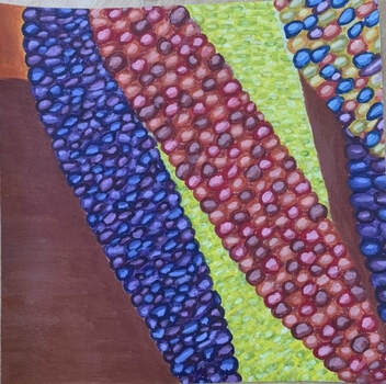
colored corn
acrylic color wheel
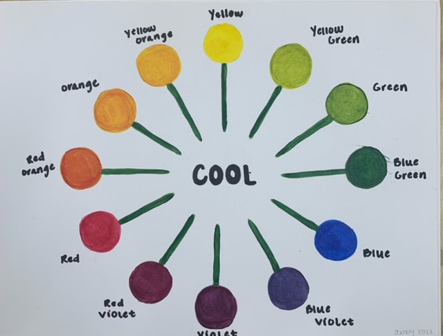
cool , suckers
|
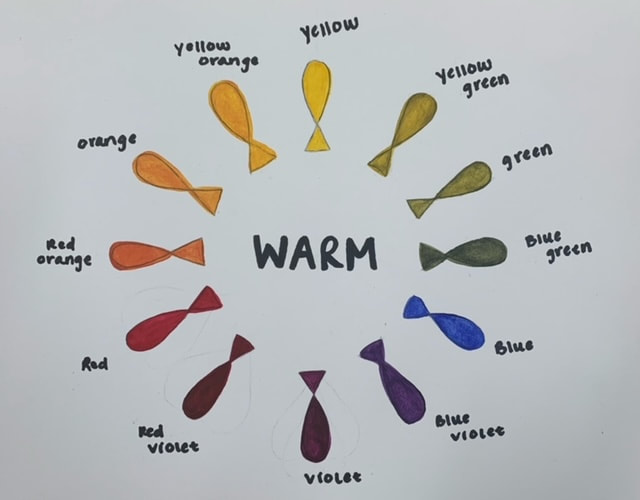
warm, fish
|
watercolor landscape/nature project
reference photos:
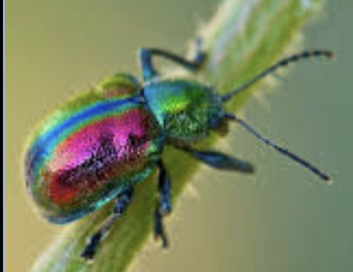
reference photo of colorful beetle 1
|
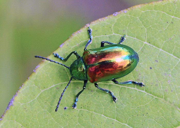
reference photo of colorful beetle 2
|
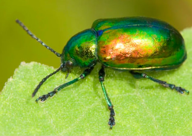
reference photo of colorful beetle 3
|
comp/color sketches:
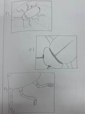
composition sketches of beetle 1, 2, and 3
|
final colored sketch
|
in progress:
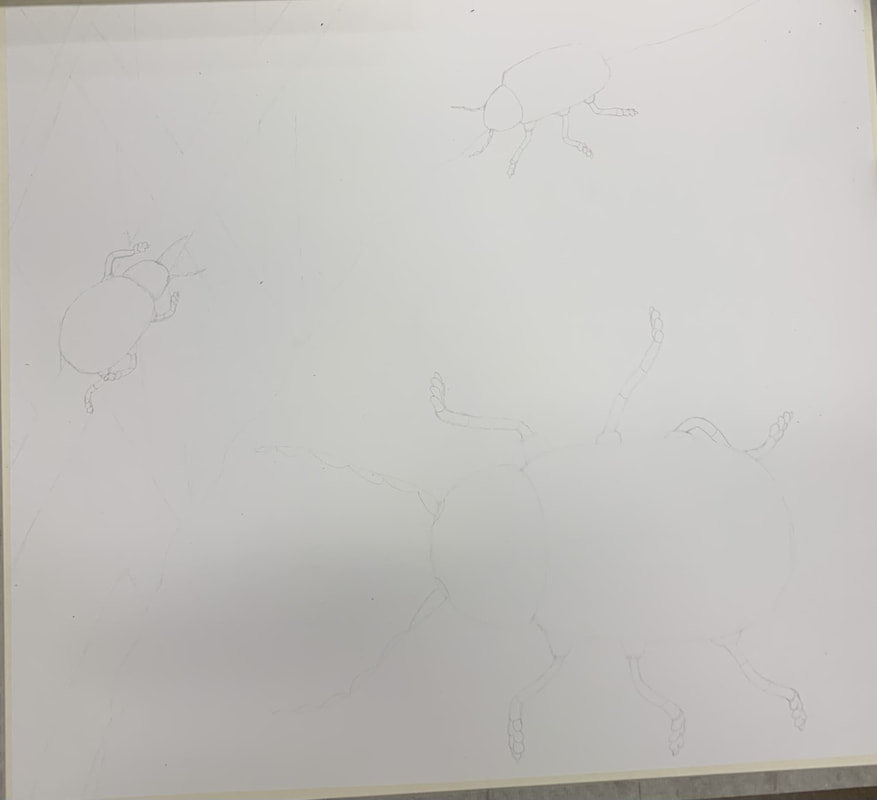
in progress photo 1, lightly sketch out the picture
|
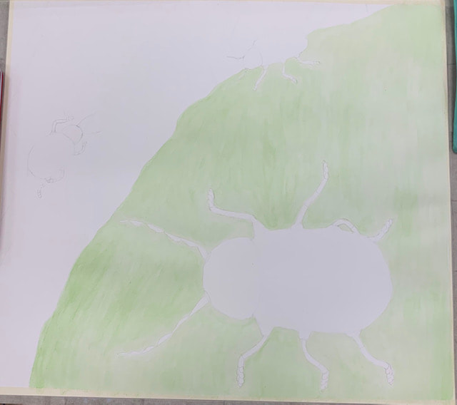
in progress photo 2, start using watercolor in light layers
|
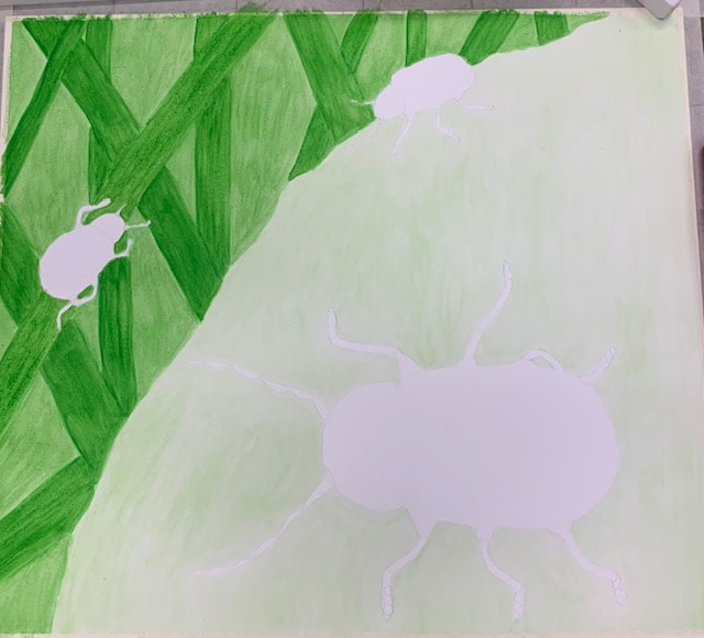
in progress photo 3, continue using watercolor, adding more layers and working on background
|
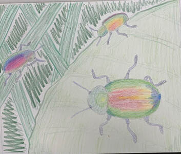
final painting
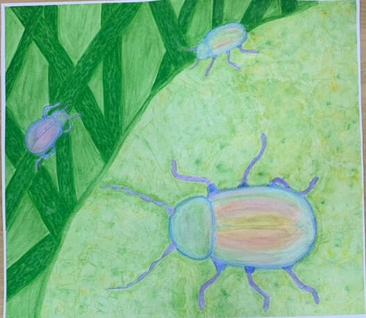
final watercolor
Self reflection questions:
1. The watercolor techniques I used included wet on wet, dry brush, layers, the salt, and the saran wrap. The saran wrap worked really well in helping me create natural looking patterns and details on the leaf. The dry brush was effective in letting me make smaller and more detailed lines.
2. Using layers of watercolor was very important for my painting because I needed different shades and values in different areas and when you add more layers it makes it look smoother and helps you build it up.
3. My composition was pretty well because the bugs are placed around in a spiral and it causes you to look around the entire painting while still having a main focus point, the big beetle.
4. Color choice was a pretty important factor considering the beetle I used for inspiration is colorful and the location of my background. Leaves and stems are shades of green and the beetles had all different colors on their backs.
5. I think my craftsmanship could improve by trying to be a little more precise. I think I did good in certain areas and aspects but I probably could improve my skills.
6. If I could do something different, I probably would have added more values and little details as well take my time with it more, I think I felt rushed when I first started and you can kind of tell.
7. I learned that with watercolor you need to be patient, yet also move quickly. You also are limited in how much water you can add so you can't always rely on being able to add more. This project wasn't super encouraging for me because I had a hard time with the paper getting too wet and was not in love with my idea.
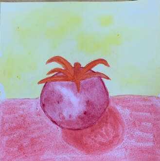
color theory- watercolor fruit
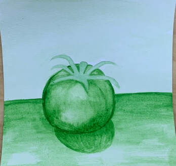
monochromatic. green. gradient technique.
|
warm colors. orange, red, yellow. wet on wet technique
|
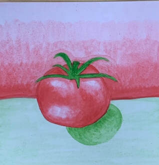
complimentary colors. green, red. layers technique.
|
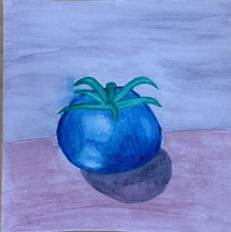
cool colors. blue, purple, teal. dry brush technique
|
watercolor value and chart 8/31 & 9/1
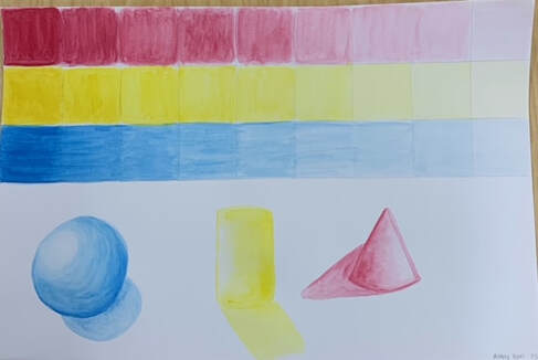
water color chart for the primary colors to show value.
on the bottom a cone, sphere, and cylinder with "shading" and value in each of the colors i used for the charts. i like watercolor and this was pretty fun and on the easier side
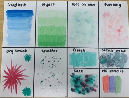
attempting different watercolor techniques
colored pencil fruit/veggie
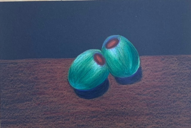
olives. i used the black paper and used prismacolor colored pencils.
colored pencil forms
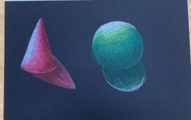
black paper, cone and sphere. I shaded and combined 3 relating colors and white to do this. I used pink and red and purple like colors for the cone and i used shades of green for the sphere
|
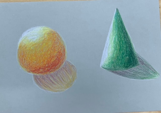
gray paper, cone and sphere. I shaded and combined 3 relating colors and white to do this. I used different shades of green for the cone and i used shades of yellow and orange and red for the sphere
|
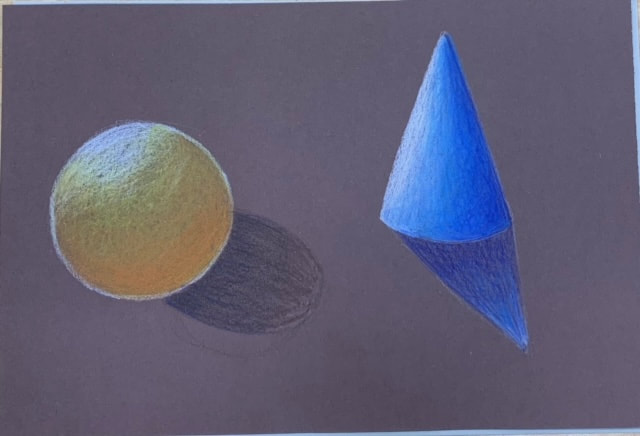
brown paper, cone and sphere. I shaded and combined 3 relating colors and white to do this. I used shades of blue for the cone and i used shades of yellow and orange for the sphere
|
4 assessment drawings
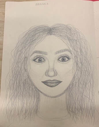
portrait of my friend Allie in my painting class. I had a hard time getting the layout and proportions right but i think it turned out alright
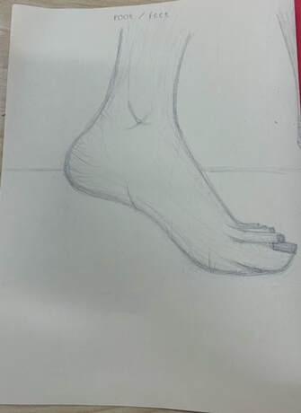
foot from the side view, attempted to lightly shade
|
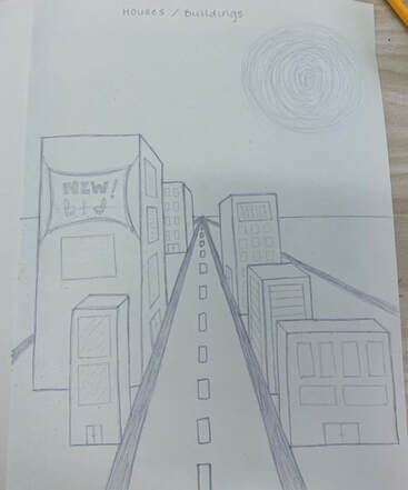
buildings in 1 pt perspective. i made a street with multiple different sized buildings with different accents. probably could have been more detailed.
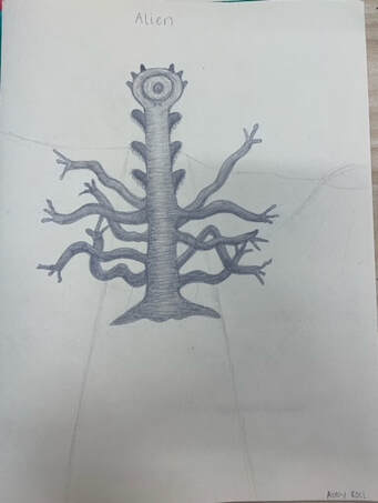
alien. tried to create an alien from my imagination and attempted to shade it and give it definition
|
