collage nature park/historical buildings work
brainstorming ideas:
- Totem pole in Wyandotte, Michigan #1
- Atlas Mountains, Morocco
- Stonehenge, Scotland #2
- Lake Michigan shore
- Great Wall of China #4
- Wilderness run alpine roller coaster, NC
- Lake Washington
- Lavender field, Hungary #3
- Space Needle, Seattle
- Giant Honey Bee statue, Canada #6
- Waterfall from Asheville
- Largest thermal bath in the world in Budapest #5
- Great pyramid of Giza, Egypt
- Frida Kahlo museum, Mexico
- Avenue of the Baobabs, Madagascar
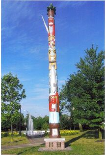
reference photo #1 for wyandotte totem pole in Michigan
|
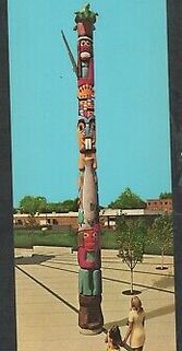
reference photo #2 for wyandotte totem pole in Michigan
|
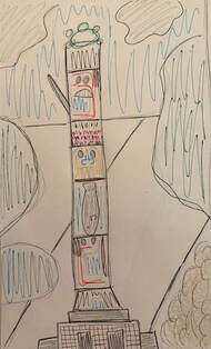
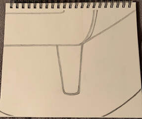
compositional sketch for wyandotte totem pole in Michigan
|
reference photo #1 for stonehenge
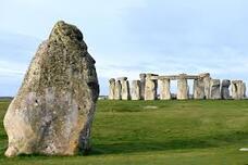
reference photo #2 for stonehenge
|
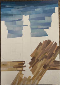
in progress photo #1 for wyandotte totem pole
|
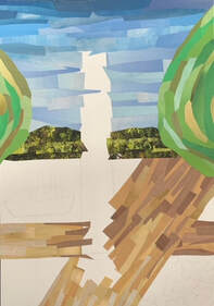
in progress photo #2 for wyandotte totem pole
|
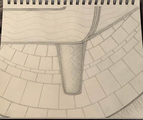
in progress photo #3 for wyandotte totem pole
|
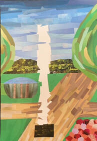
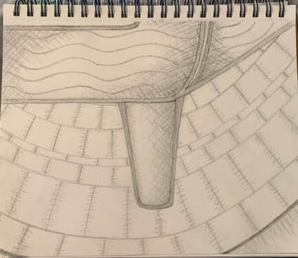
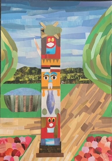 final collage work for wyandotte totem pole
Self reflection questions:
1. I chose the Wyandotte totem pole in Wyandotte, Michigan because it belongs to my tribe. This is our tribes specific totem pole and it has historical importance to us. I liked the composition of having one main attention grabber and then other 'eye grabbing' spots in the background.
2. I think I added good value, I had the sky go from dark blue down to light blue and the pathway go from medium brown to light beige. My proportions are okay, I included having a bigger tree and a smaller tree while having the distance look like big hills but further back to appear like they were farther away. But i possibly could have made the fountain look farther back then it was.
3. I used textures in the background with the hills to make it appear like there were trees and greenery. I also tried to use different textures up front with my pink/red/salmon flowers so they wouldn't appear so perfect looking.
4. I knew I wanted my collage to look neat, so I chose to include linear and almost parallel lines in the sky and the pathway. I wanted it to flow together. I also did a similar technique with the trees by making it look like the lines were spiraling in circular motion from the center. In order to create the shapes I wanted, I mocked the appearance of the object I was making so the viewer could tell what they were looking at.
5. I do feel like I used a range of values in my collage by going from dark to light in certain areas. I had a background, which was the hills, the fountain, and the sky. I had a middle ground which was the trees and the pathway. And i had a foreground which was the totem pole and the flowers. I tried to make it look as if it was going further back as you looked more at it by adding values and different textures but it was definitely difficult to do with just random, small pieces from a magazine.
6. I would say my work has good craftsmanship. I think you can tell that I thought about where to put every piece and what direction to put it. I also kept it neat and clean so it could look sharp and have different points stick out at different times. Each part is pretty unique, strong, or vibrant in its own way so I feel like there are minimal places in my work that seem boring or neglected.
7. If I were to redo this project I don't think that there are many things that I would do differently. I maybe would try to improve the flowers or the grass to add more details and textures but other than that, I actually really like how this turned out. It definitely took awhile and a lot of focusing and patience but I think I did a good job making it look unique. My favorite part is definitely the totem pole itself, I wouldn't change anything there for sure.
o'keeffe inspired watercolor work
brainstorming ideas:
- Thick tree bark
- Water falling down from a waterfall
- Yellow calcite crystal #4
- Back of a snake #3
- Hermit crab shell
- Multi colored corn
- Inch worm #5
- Edge of a cloud
- Bumble bee #2
- Seeds (pumpkin or sunflower shell)
- Algae/moss on a tree with thick tree bark #1
- Stink bug
- Raindrop hitting the ground/splashing
- Caterpillar
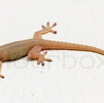
- Gecko lizard arm/hand #6
practice final sketch (previous in progress photo before i restarted, once i restarted i did not take any progress photos I did my final art work in one sitting)
|
compositional photo #1
|
compositional photo #2
|
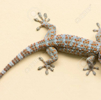
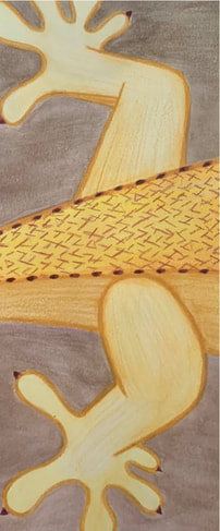 final painting, done with watercolor and colored pencil. up close drawing of a lizards back legs
Self Reflecting Questions:
1. I used the watercolor technique wet on wet and layers of wash. for the brown background I used wet on wet so it wouldn't be too harsh. for the actually lizard I started with wet on wet to get a base color down, then later on to add value I used layers of wash on certain parts of the gecko.
2. using transparent layers with watercolor wasn't too important for my work considering i topped it off with colored pencil. 3. my composition was successful in the way that I had minimal open space and the lizard took up most of the space. I wouldn't say I utilized all the elements of art and principles of design but I used some, by adding directional lines with colored pencils, value, and definition.
4. I would say color choice was not super important with my work. Lizards come in all colors, I just chose yellows/oranges/beiges and a reddish brown color because it matched one of my reference photos.
5. I used my knowledge of Georgia O'keeffe as an inspiration one by zooming in very up close to the lizards back legs, just like she has done in her previous watercolor work. 6. I would describe my craftsmanship as decent. I think you can tell I put some time in the work, it's not the best or super intricate but I used my resources and tried to be simplistic.
7. If I was an art critic, I think I would find this work alright. If I took into consideration that I am 16 and not a professional artist or took too long on this piece, I would have negative and positive things to say about it.
8. If I were able to do something different, I would try to make it look more realistic and improve the background. I think I needed to work better on the claws to make it look more like a real lizard and I would want to make the background look a lot cleaner and less patchy.
9. I learned about different watercolor techniques and how to layer them. I personally do not like watercolor so I didn't have too much fun with this project, I like colored pencil however so it wasn't too horrible. I just wouldnt do it again.
watercolor week 2
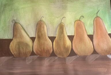
i used watercolor to recreate a picture of 5 pears. I used the colors green, brown, yellow, dark green, purple, white, and orange
colored pencil week 2
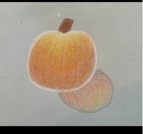
i used prismacolors to draw and shade in a pumpkin. I used orange, brown, yellow, tan, and white for value
watercolor week 1
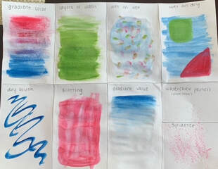
practicing watercolor techniques in class
|
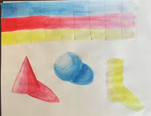
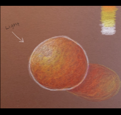
watercolor value shading with the primary colors. below that are a cone, sphere, and cylinder each painted with a different color
|
colored pencil week 1 (shading/value)
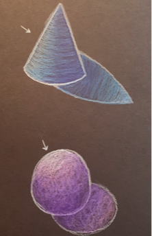
i used prismacolors on the black paper. i drew a cone and a sphere.
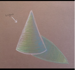
i used prismacolors on the brown paper. i drew a cone with a light source
|
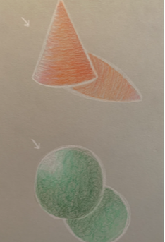
i used prismacolors on the gray paper. i drew a cone and a sphere.
I used prismacolors on the brown paper. i drew a sphere with a light source
|
pen perspective fairytale drawing
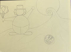
progress photo #1. started off by drawing the main things with pencil
|
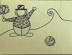
progress photo #2. started to trace over with pen and added some details
|
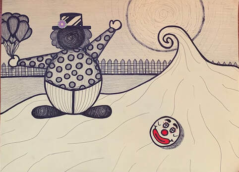
final drawing done. finished tracing in pen, added more details, and then added value and shading
pen ink - 3 pt.
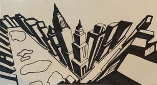
3 point perspective on a city drawn with pen
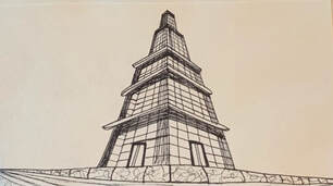
3 point perspective of a building drawn with pen
pen ink - 2pt.
less busy city with 2 pt perspective, drew with pen
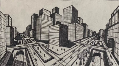
city with 2 point perspective, drew with pen
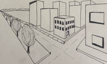
pen ink- 1 pt.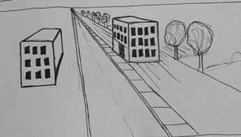
drew with pen, 1 pt perspective of city street
|
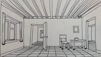
drew with pen, 1 pt perspective of room
|
Forced perspective picture
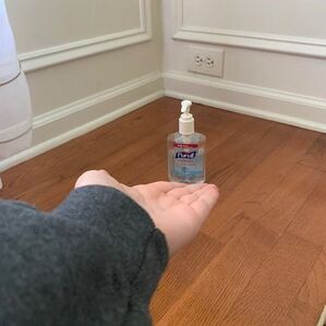
forced perspective picture of hand sanitizer
pen ink video tutorial drawings
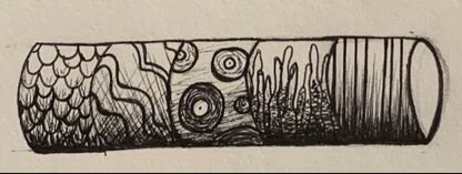
ink tutorial video #1) a cylinder , done with pen
pen techniques worksheets
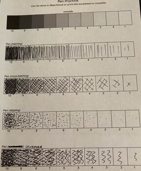
value technique worksheet done with pen using hatching, cross-hatching, stippling, and invented
|
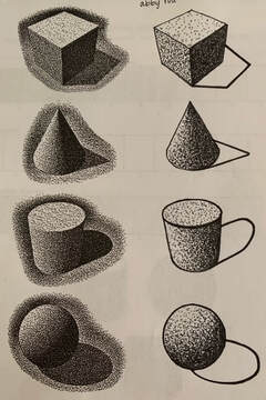
pen stippling worksheet done with pen on a cube, cone, cylinder, and sphere
|
pen ink TEchnique practice 9/29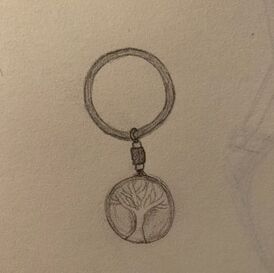
a keychain. drew with a pencil in 5 minutes
|
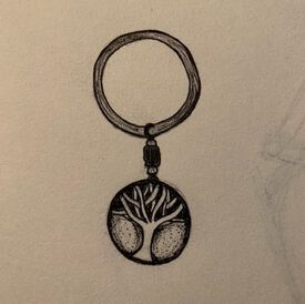
same keychain drawing from before, but with pen added on top of the previous outline. FINAL
|
unseen things progress photos & final result
first progress photo of the chair leg
|
second progress photo of the chair leg
|
 last progress photo of the chair leg. all completed
1. i started it off by drawing the outline of my work where i knew the darkest lines would be. then i started to fill in the blank spaces with details in the chair and the rug. then i added the cross hatching once the chair and rug were completed.
2. composition is pretty important for my particular piece because it is not abstract.
3. i just kinda created values as i went along and guessed where they might be to emphasize certain areas of my drawing.
4. i used medium to light values in my piece, i did not press down too hard on my pencil while drawing.
5. i would say it's decently neat and the execution could have been a little better, but overall not too bad.
6. the only technique i needed to learn prior to my drawing was cross hatching, other than that, i used my previous knowledge.
7. i grew as an artist by learning to take my time while drawing and adding different values to my art
8. i didn't have many obstacles other than accidentally smudging the pencil work with my hand while i was drawing across the page.
graphite week 1
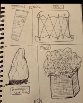
for the 4 contour drawings , in pencil i drew a tube of aquaphor and a drum.
in pen i drew a salt lamp and a plant.
|
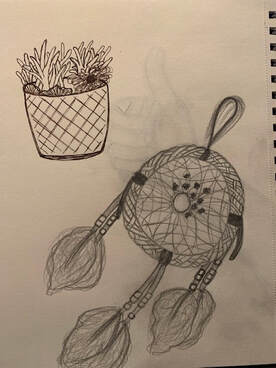
for the 20 minute contour drawings i drew another plant in pen and my dreamcatcher in pencil
|
Week 2- final pictures that tell a story
These pictures tell a simple version of a story about the start of online school. While taking these pictures, i used different compositions such as the rule of thirds and the golden spiral.
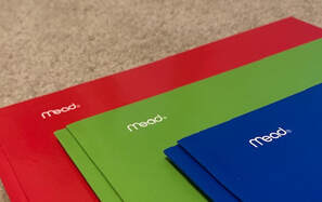
For the photograph of the 3 folders, I used proportions, measurements, and the space in order to evenly distribute the folders. Each new folders top left corner is directly located under the "m" in mead. I did this on purpose to emphasize the layered amounts of work we will have to do this year.
For the photograph of the 3 folders, I used proportions, measurements, and the space in order to evenly distribute the folders. Each new folders top left corner is directly located under the "m" in mead. I did this on purpose to emphasize the layered amounts of work we will have to do this year.

For the picture of the computer, I used the rule of thirds to attract the viewers eye to the corner of the computer where its being charged. The reason i chose to use this photo is because we are on the computer every single day now for multiple hours. That becomes extremely draining so i showed how while our computers are running low on battery, we are as well.
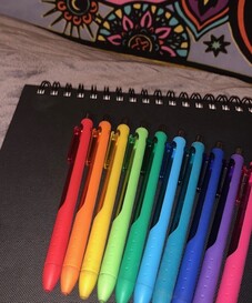
For the picture of the color coded pens, i used a mixture in between the golden spiral and the rule of thirds. I put the pens in rainbow order to draw the viewers eyes from the middle of the picture, the red pen, all the way out to the edge of the picture, the pink pen. I wanted the background to be included into the picture because the tapestry behind it is also very colorful, yet the middle ground is black and gray, so it isn't excessive. I chose to use the pens because they represent how we have to be organized and very much in order to be able to function during online school.
I think the successful part of my project was having neat pictures and everything in order.
I learned how to use different angles and POVs to capture new perspectives on the objects.
I think the successful part of my project was having neat pictures and everything in order.
I learned how to use different angles and POVs to capture new perspectives on the objects.
Week 2- random object 9 composition photos
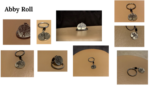
I chose a key chain with the tree of life on it for my 9 pictures. We had to use the rule of thirds, the golden spiral, and symmetrical compositions. I then edited and cropped each picture.
Week 1- 4 assessment drawings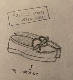
the pair of shoes with laces. I chose to draw my moccasins and used a normal pencil and my finger to blend certain things
|
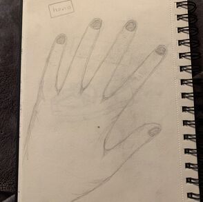
the hand. to be honest, i just traced my hand and then added in some details and fixed some lines.
|
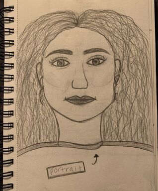
the portrait of a friend. I just used a picture of amelia and then looked up images of how to start the base of the face on google.
|
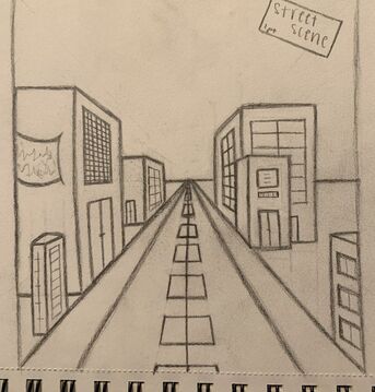
the 1 pt. street scene with 3 buildings on each side. I used a flat edge to make all the angled lines that had to connect to the middle. I added windows, doors, and banners.
|
